Overview
Pinturas is a small construction and design company involved in developing concepts for the future, public areas, private homes, and recreational spaces.
Position
Lead designer
3D designer
Concept designer
Graphic designer
Task: maintaining the company brand, developing concepts, creating 3D models and visualizations.
Goal: to increase brand recognition, reduce project approval timelines, and enhance customer loyalty.
My Role
As a multidisciplinary designer and graphic designer, I participated in the company’s rebranding and maintained it, developed engaging concepts for public and private spaces, led projects and a team of designers to successful completion, and created stunning 3D models that contributed to increased customer loyalty and reduced project approval times.
Identity
Research
The research phase explores Pinturas’ unique brand, focusing on the Pinturas Canyon’s color palette, textures, and natural shapes, which represent strength and beauty. Competitor analysis ensures Pinturas stands out in the construction and design sector with a distinct visual identity.
Moodboard
A moodboard is created, featuring natural elements from the canyon: shades of orange and blue, stone and water textures, and branding from the industry. It sets the visual direction, combining nature and architecture for inspiration.
Concept & logo
The concept emphasizes the canyon’s symbolism of strength, reliability, and harmony with nature. Pinturas is positioned as a professional, innovative company blending nature with modern construction solutions. The logo is inspired by canyon shapes, using geometric lines and natural textures like rocks or rivers to represent nature’s connection. It should be simple, modern, and memorable, symbolizing reliability and aesthetics.
Assotiations:
#Argentina
#Canyon
#River
#Nature
Colors
The color palette reflects nature and professionalism:
+ Orange symbolizes energy and creativity.
+ Black conveys strenth and elegance.
+ White represents purity and reliability.
+ Blue evokes calm and confidence.

#E18C44

#479FC5

#201600

#FFFFFF
Branding
Branding elements like business cards, packaging, and websites are designed with the logo and colors in mind, focusing on simplicity, elegance, and professionalism to reflect the company’s high-quality, stylish solutions.
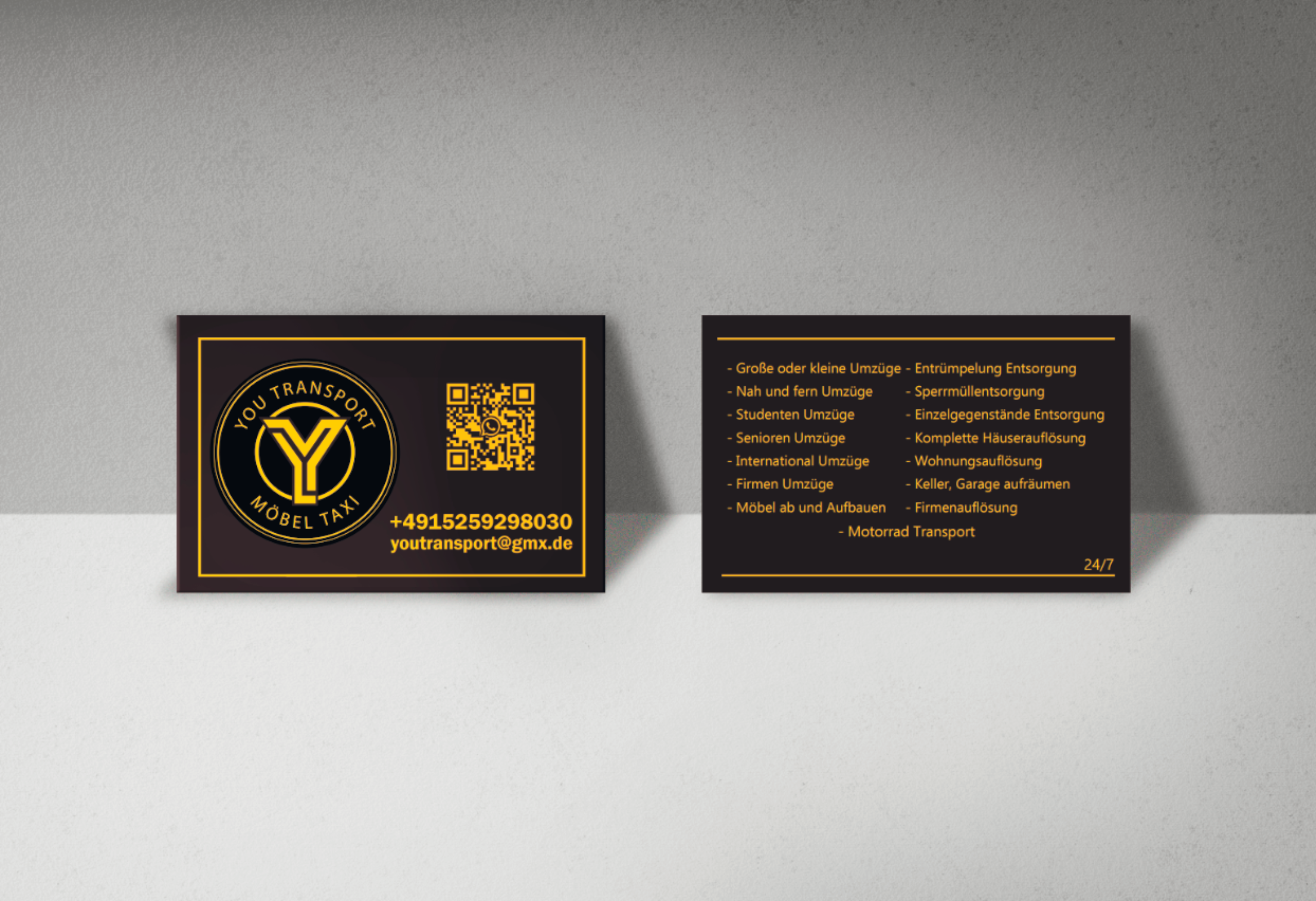
Business card for transport company
Task
Design a graphic business card for a transportation company that conveys a minimalist and premium aesthetic. The client’s requirements included a black and gold color scheme, a sophisticated layout, and a logo featuring the first letter of the company’s name as a central design element.
Result
A sleek, elegant business card was created, meeting the client’s vision for a high-end look. The design features a refined black background with gold accents, adding a touch of luxury. The logo, a stylized representation of the company’s initial, serves as a focal point and is crafted to convey strength and professionalism, aligning with the premium tone desired by the client. The card’s layout maintains clean lines and ample negative space, enhancing the card’s modern, upscale feel.
3D-concept for private rest area
Task
Design a private beach leisure area that accommodates both solitary relaxation and social gatherings. The space should be functional and aesthetically pleasing for any time of day. Key features should include
natural integration with the environment.
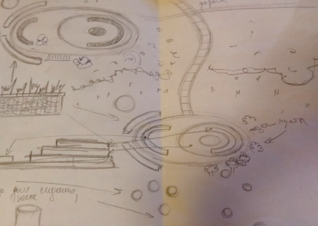
Short sketch on lap:
Material research:
Short area research:
Study of the area, weather, temperature, soil conditions
Simple modeling ->
Understanding shapes, proportions, sizes
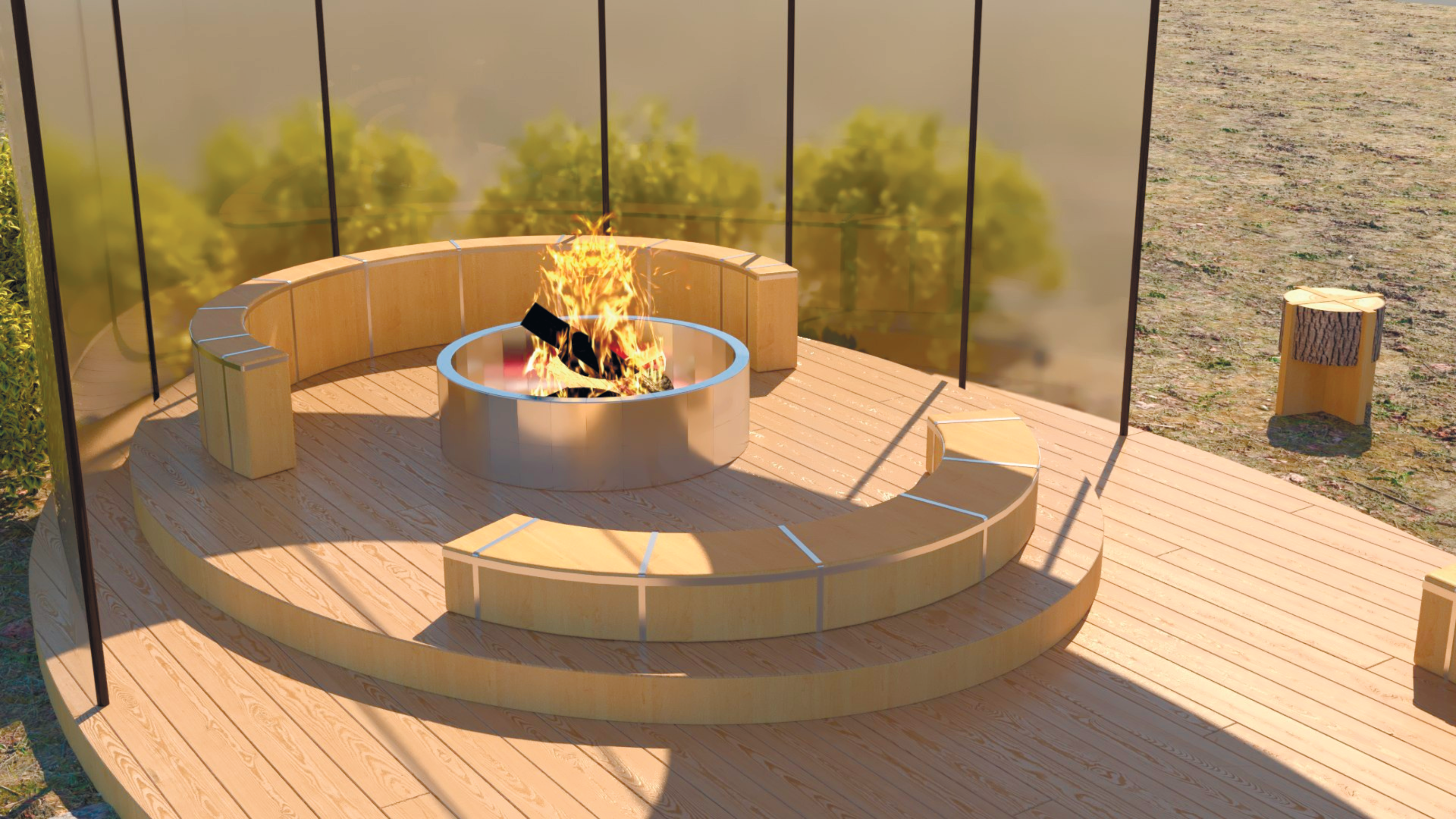
Final modeling ->
Final modeling with realistic rendering, using all textures and lighting.
Result
The recreation area project was successfully completed, fully meeting all of the client’s requirements and exceeding expectations. The client highly appreciated the work, approved the project, and expressed eagerness to continue collaborating further.
Poster graphics
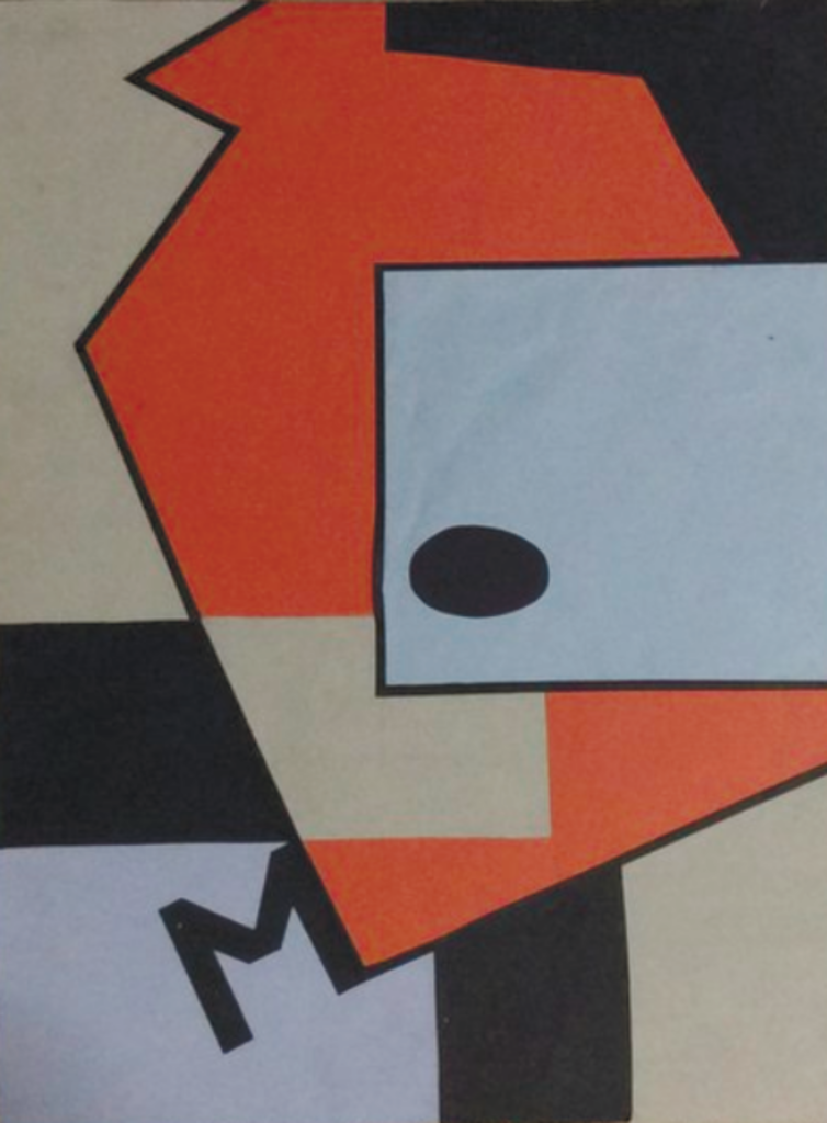
Task: сreate an interior kitchen collage featuring the first letter of the client’s last name.
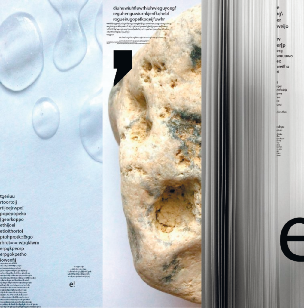
Task: a series of posters for a workshop on creativity, typography, and creative experiments.
Task: сreate a series of posters based on references for the upcoming promotion of a new game startup.
Result
In my work, I skillfully balanced multiple tasks at once, achieving high results even in the most challenging situations. My approach, focused on the needs of each client, helped increase their satisfaction and strengthen their trust in the company. As a result, we were able to not only boost the brand’s recognition but also expand the range of services offered, allowing the company to meet diverse client needs and solidify its position in the market.